PptxGenJS
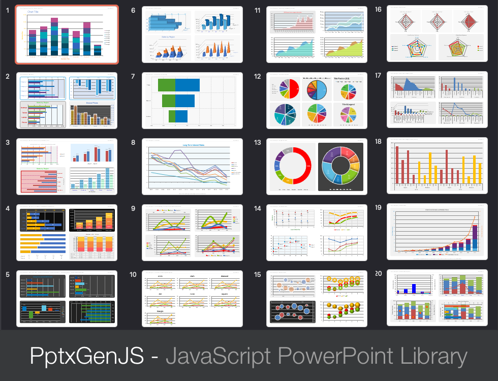
Charts of almost any type can be added to Slides, including combo and 3D charts. See demos/modules/demo_chart.mjs for the working code used to create the charts shown below.
Usage
let pres = new pptxgen();
let dataChartAreaLine = [
  {
    name: "Actual Sales",
    labels: ["Jan", "Feb", "Mar", "Apr", "May", "Jun", "Jul", "Aug", "Sep", "Oct", "Nov", "Dec"],
    values: [1500, 4600, 5156, 3167, 8510, 8009, 6006, 7855, 12102, 12789, 10123, 15121],
  },
  {
    name: "Projected Sales",
    labels: ["Jan", "Feb", "Mar", "Apr", "May", "Jun", "Jul", "Aug", "Sep", "Oct", "Nov", "Dec"],
    values: [1000, 2600, 3456, 4567, 5010, 6009, 7006, 8855, 9102, 10789, 11123, 12121],
  },
];

slide.addChart(pres.ChartType.line, dataChartAreaLine, { x: 1, y: 1, w: 8, h: 4 });
Core Chart Types
- Chart type can be any one of
pptx.ChartType - Currently:
pptx.ChartType.area,pptx.ChartType.bar,pptx.ChartType.bar3d,pptx.ChartType.bubble,pptx.ChartType.bubble3d,pptx.ChartType.doughnut,pptx.ChartType.line,pptx.ChartType.pie,pptx.ChartType.radar,pptx.ChartType.scatter
Combo Charts
- Chart types can be any one of
pptx.ChartType, althoughpptx.ChartType.area,pptx.ChartType.bar, andpptx.ChartType.linewill give the best results. - There should be at least two chart-types. There should always be two value axes and category axes.
- Combo charts have a different function signature than standard. There are two parameters:
chartTypes: Array of objects, each withtype,data, andoptionsobjects.options: Standard options as used with single charts. Can include axes options.
- Columns makes the most sense in general. Line charts cannot be rotated to match up with horizontal bars (a PowerPoint limitation).
- Can optionally have a secondary value axis.
- If there is secondary value axis, a secondary category axis is required in order to render, but currently always uses the primary labels. It is recommended to use
catAxisHidden: trueon the secondary category axis. - Standard options are used, and the chart-type-options are mixed in to each.
Usage Notes
- Zero values can be hidden using Microsoft formatting specs (see Issue #288)
- Use
*LabelFormatCodeprops to format numbers - see Microsoft Number Format Codes - Examples: The
demos/modules/demo_chart.mjsfile has 17 slides of well-documented chart examples
Properties
Position/Size Props (PositionProps)
| Option | Type | Default | Description | Possible Values |
|---|---|---|---|---|
x |
number | 1.0 |
hor location (inches) | 0-n |
x |
string | hor location (percent) | ‘n%’. (Ex: {x:'50%'} middle of the Slide) |
|
y |
number | 1.0 |
ver location (inches) | 0-n |
y |
string | ver location (percent) | ‘n%’. (Ex: {y:'50%'} middle of the Slide) |
|
w |
number | 1.0 |
width (inches) | 0-n |
w |
string | width (percent) | ‘n%’. (Ex: {w:'50%'} 50% the Slide width) |
|
h |
number | 1.0 |
height (inches) | 0-n |
h |
string | height (percent) | ‘n%’. (Ex: {h:'50%'} 50% the Slide height) |
General (IChartOpts), Data Table (IChartPropsDataTable), Legend (IChartPropsLegend), Title (IChartPropsTitle)
| Option | Type | Default | Description | Possible Values |
|---|---|---|---|---|
altText |
string | chart alt text | string shown in the “alt text” panel in PowerPoint | |
chartArea |
object | chart area fill/border | fill and/or border. Ex: { fill: { color:"0088CC" }, border: {pt:'1', color:'f1f1f1'}, roundedCorners:true } |
|
chartColors |
array | data colors | array of hex color codes. Ex: ['0088CC','FFCC00'] |
|
chartColorsOpacity |
number | 100 |
data color opacity (percent) | 1-100. Ex: { chartColorsOpacity:50 } |
dataTableFontSize |
number | data table font size | 1-256. Ex: { dataTableFontSize: 13 } |
|
holeSize |
number | 50 |
doughnut hole size (percent) | 1-100. Ex: { holeSize:50 } |
invertedColors |
array | data colors for negative numbers | array of hex color codes. Ex: ['0088CC','FFCC00'] |
|
legendFontFace |
string | Arial |
font face | font name. Ex: { legendFontFace:'Arial' } |
legendFontSize |
number | 10 |
legend font size | 1-256. Ex: { legendFontSize: 13 } |
legendColor |
string | 000000 |
legend text color | hex color code. Ex: { legendColor: '0088CC' } |
legendPos |
string | r |
chart legend position | b (bottom), tr (top-right), l (left), r (right), t (top) |
layout |
object | positioning plot within chart area | object with x, y, w and h props, all in range 0-1 (proportionally related to the chart size). Ex: {x: 0, y: 0, w: 1, h: 1} fully expands chart within the plot area |
|
plotArea |
object | plot area fill/border | fill and/or border. Ex: { fill: { color: "0088CC" }, border: {pt:'1', color:'f1f1f1'} } |
|
radarStyle |
string | standard |
radar chart style | standard, marker, filled |
showDataTable |
boolean | false |
show Data Table under the chart | true or false (Not available for Pie/Doughnut charts) |
showDataTableKeys |
boolean | true |
show Data Table Keys (color blocks) | true or false (Not available for Pie/Doughnut charts) |
showDataTableHorzBorder |
boolean | true |
show Data Table horizontal borders | true or false (Not available for Pie/Doughnut charts) |
showDataTableVertBorder |
boolean | true |
show Data Table vertical borders | true or false (Not available for Pie/Doughnut charts) |
showDataTableOutline |
boolean | true |
show Data Table table outline | true or false (Not available for Pie/Doughnut charts) |
showLabel |
boolean | false |
show data labels | true or false |
showLeaderLines |
boolean | false |
show leader lines | true or false |
showLegend |
boolean | false |
show chart legend | true or false |
showPercent |
boolean | false |
show data percent | true or false |
showTitle |
boolean | false |
show chart title | true or false |
showValue |
boolean | false |
show data values | true or false |
title |
string | chart title | Ex: { title:'Sales by Region' } |
|
titleAlign |
string | center |
chart title text align | left center or right Ex: { titleAlign:'left' } |
titleColor |
string | 000000 |
title color | hex color code. Ex: { titleColor:'0088CC' } |
titleFontFace |
string | Arial |
font face | font name. Ex: { titleFontFace:'Arial' } |
titleFontSize |
number | 18 |
font size | 1-256. Ex: { titleFontSize:12 } |
titlePos |
object | title position | object with x and y values. Ex: { titlePos:{x: 0, y: 10} } |
|
titleRotate |
integer | title rotation (degrees) | 0-359. Ex: { titleRotate:45 } |
Cat Axis (IChartPropsAxisCat) and Val Axis (IChartPropsAxisVal)
| Option | Type | Default | Description | Possible Values |
|---|---|---|---|---|
catAxisBaseTimeUnit |
string | category-axis base time unit | days months or years |
|
catAxisCrossesAt |
multi | category-axis crosses at | number or autoZero |
|
catAxisHidden |
boolean | false |
hide category-axis | true or false |
catAxisLabelColor |
string | 000000 |
category-axis color | hex color code. Ex: { catAxisLabelColor:'0088CC' } |
catAxisLabelFontBold |
boolean | false |
make cat axis label bold | true or false |
catAxisLabelFontFace |
string | Arial |
category-axis font face | font name. Ex: { titleFontFace:'Arial' } |
catAxisLabelFontSize |
integer | 18 |
category-axis font size | 1-256. Ex: { titleFontSize:12 } |
catAxisLabelFrequency |
integer | PPT “Interval Between Labels” | 1-n. Ex: { catAxisLabelFrequency: 2 } |
|
catAxisLabelPos |
string | nextTo |
category-axis label position | low, high, or nextTo . Ex: { catAxisLabelPos: 'low' } |
catAxisLabelRotate |
integer | category-axis rotation (degrees) | 0-360. Ex: { catAxisLabelRotate:45 } |
|
catAxisLineColor |
string | 000000 |
category-axis line color | hex color code. Ex: { catAxisTitleColor:'0088CC' } |
catAxisLineShow |
boolean | true |
show/hide category-axis line | true or false |
catAxisLineSize |
integer | 18 |
category-axis font size | 1-256. Ex: { titleFontSize:12 } |
catAxisLineStyle |
string | solid |
category-axis line style | solid, dash, dot |
catAxisMajorTickMark |
string | category-axis major tick mark | none, inside, outside, cross |
|
catAxisMajorTimeUnit |
string | category-axis major time unit | days, months or years |
|
catAxisMaxVal |
integer | category-axis max value | Integer. Ex: { catAxisMaxVal:10 } |
|
catAxisMinVal |
integer | category-axis min value | Integer. Ex: { catAxisMinVal:0 } |
|
catAxisMinorTickMark |
string | category-axis minor tick mark | none, inside, outside, cross |
|
catAxisMinorTimeUnit |
string | category-axis minor time unit | days, months or years |
|
catAxisMajorUnit |
integer | category-axis major unit | Positive integer. Ex: { catAxisMajorUnit:12 } |
|
catAxisMinorUnit |
integer | category-axis minor unit | Positive integer. Ex: { catAxisMinorUnit:1 } |
|
catAxisMultiLevelLabels |
boolean | false |
show multi-level labels | true or false. Ex:{ catAxisMultiLevelLabels:true } |
catAxisOrientation |
string | minMax |
category-axis orientation | maxMin (high->low) or minMax (low->high) |
catAxisTitle |
string | Axis Title |
axis title | a string. Ex: { catAxisTitle:'Regions' } |
catAxisTitleColor |
string | 000000 |
title color | hex color code. Ex: { catAxisTitleColor:'0088CC' } |
catAxisTitleFontFace |
string | Arial |
font face | font name. Ex: { catAxisTitleFontFace:'Arial' } |
catAxisTitleFontSize |
integer | font size | 1-256. Ex: { catAxisTitleFontSize:12 } |
|
catAxisTitleRotate |
integer | title rotation (degrees) | 0-360. Ex: { catAxisTitleRotate:45 } |
|
catGridLine |
object | none |
category grid line style | object with properties size (pt), color and style ('solid', 'dash' or 'dot') or 'none' to hide |
showCatAxisTitle |
boolean | false |
show category (vert) title | true or false. Ex:{ showCatAxisTitle:true } |
showSerName |
boolean | false |
show serie name | true or false. Ex:{ showSerName:true } |
showValAxisTitle |
boolean | false |
show values (horiz) title | true or false. Ex:{ showValAxisTitle:true } |
valAxisCrossesAt |
multi | value-axis crosses at | number or autoZero |
|
valAxisDisplayUnit |
string | display units | billions, hundredMillions, hundreds, hundredThousands, millions, tenMillions, tenThousands, thousands, trillions |
|
valAxisHidden |
boolean | false |
hide value-axis | true or false |
valAxisLabelColor |
string | 000000 |
value-axis color | hex color code. Ex: { valAxisLabelColor:'0088CC' } |
valAxisLabelFontBold |
boolean | false |
make val axis label bold | true or false |
valAxisLabelFontFace |
string | Arial |
value-axis font face | font name. Ex: { titleFontFace:'Arial' } |
valAxisLabelFontSize |
integer | 18 |
value-axis font size | 1-256. Ex: { titleFontSize:12 } |
valAxisLabelFormatCode |
string | General |
value-axis number format | format string. Ex: { axisLabelFormatCode:'#,##0' } |
valAxisLineColor |
string | 000000 |
value-axis line color | hex color code. Ex: { catAxisTitleColor:'0088CC' } |
valAxisLineShow |
boolean | true |
show/hide value-axis line | true or false |
valAxisLineSize |
integer | 18 |
value-axis font size | 1-256. Ex: { titleFontSize:12 } |
valAxisLineStyle |
string | solid |
value-axis line style | solid, dash, dot |
valAxisLogScaleBase |
number | logarithmic scale | 2-99 | |
valAxisMajorTickMark |
string | value-axis major tick mark | none, inside, outside, cross |
|
valAxisMajorUnit |
number | 1.0 |
value-axis tick steps | Float or whole number. Ex: { majorUnit:0.2 } |
valAxisMaxVal |
number | value-axis maximum value | 1-N. Ex: { valAxisMaxVal:125 } |
|
valAxisMinVal |
number | value-axis minimum value | 1-N. Ex: { valAxisMinVal: -10 } |
|
valAxisMinorTickMark |
string | value-axis minor tick mark | none, inside, outside, cross |
|
valAxisOrientation |
string | minMax |
value-axis orientation | maxMin (high->low) or minMax (low->high) |
valAxisTitle |
string | Axis Title |
axis title | a string. Ex: { valAxisTitle:'Sales (USD)' } |
valAxisTitleColor |
string | 000000 |
title color | hex color code. Ex: { valAxisTitleColor:'0088CC' } |
valAxisTitleFontFace |
string | Arial |
font face | font name. Ex: { valAxisTitleFontFace:'Arial' } |
valAxisTitleFontSize |
number | font size | 1-256. Ex: { valAxisTitleFontSize:12 } |
|
valAxisTitleRotate |
integer | title rotation (degrees) | 0-360. Ex: { valAxisTitleRotate:45 } |
|
valGridLine |
object | value grid line style | object with properties size (pt), color and style ('solid', 'dash' or 'dot') or 'none' to hide |
Bar (IChartPropsChartBar), Data Label (IChartPropsDataLabel), Line (IChartPropsChartLine)
| Option | Type | Default | Description | Possible Values |
|---|---|---|---|---|
barDir |
string | col |
bar direction | (Bar Chart) bar (horizontal) or col (vertical). Ex: {barDir:'bar'} |
barGapWidthPct |
number | 150 |
width between bar groups (percent) | (Bar Chart) 0-500. Ex: { barGapWidthPct:50 } |
barGrouping |
string | clustered |
bar grouping | (Bar Chart) clustered or stacked or percentStacked. |
barOverlapPct |
number | 0 |
overlap (percent) | (Bar Chart) -100-100. Ex: { barOverlapPct:50 } |
catLabelFormatCode |
string | format to show data value | format string. Ex: { catLabelFormatCode:'#,##0' } |
|
dataBorder |
object | data border | object with pt and color values. Ex: border:{pt:'1', color:'f1f1f1'} |
|
dataLabelColor |
string | 000000 |
data label color | hex color code. Ex: { dataLabelColor:'0088CC' } |
dataLabelFormatCode |
string | format to show data value | format string. Ex: { dataLabelFormatCode:'#,##0' } |
|
dataLabelFormatScatter |
string | custom |
label format | (Scatter Chart) custom,customXY,XY |
dataLabelFontBold |
boolean | false |
make data label bold | Ex: { dataLabelFontBold:true } |
dataLabelFontFace |
string | Arial |
value-axis font face | font name. Ex: { titleFontFace:'Arial' } |
dataLabelFontSize |
number | 18 |
value-axis font size | 1-256. Ex: { titleFontSize:12 } |
dataLabelPosition |
string | bestFit |
data label position | bestFit,b,ctr,inBase,inEnd,l,outEnd,r,t |
dataNoEffects |
boolean | false |
whether to omit effects on data | (Doughnut/Pie Charts) true or false |
displayBlanksAs |
string | span |
whether to draw line or gap | (Line Charts) span or gap |
lineCap |
string | line cap style | flat, round, square |
|
lineDash |
string | solid |
(Bar/Scatter Chart) border line dash style | dash, dashDot, lgDash, lgDashDot, lgDashDotDot, solid, sysDash or sysDot |
lineDataSymbol |
string | circle |
symbol used on line marker | circle,dash,diamond,dot,none,square,triangle |
lineDataSymbolSize |
number | 6 |
size of line data symbol | 1-256. Ex: { lineDataSymbolSize:12 } |
lineDataSymbolLineSize |
number | 0.75 |
size of data symbol outline | 1-256. Ex: { lineDataSymbolLineSize:12 } |
lineDataSymbolLineColor |
string | 000000 |
color of data symbol line | hex color code. Ex: { lineDataSymbolLineColor:'0088CC' } |
lineSize |
number | 2 |
thickness of data line (0 is no line) | 0-256. Ex: { lineSize: 1 } |
lineSmooth |
boolean | false |
whether to smooth lines | true or false - Ex: { lineSmooth: true } |
shadow |
ShadowProps | data element shadow options | none or ShadowProps |
3D Bar Chart (IChartPropsChartBar), Series Axis (IChartPropsDataTable)
| Option | Type | Default | Description | Possible Values |
|---|---|---|---|---|
bar3DShape |
string | box |
bar 3d shape | box, cylinder, coneToMax, pyramid, pyramidToMax |
barGapDepthPct |
number | 150 |
width between bar groups (percent) | 0-500. Ex: { barGapWidthPct:50 } |
dataLabelBkgrdColors |
boolean | false |
bkgd color is series color | true or false |
serAxisBaseTimeUnit |
string | series-axis base time unit | days months or years |
|
serAxisHidden |
boolean | false |
hide series-axis | true or false |
serAxisOrientation |
string | minMax |
series-axis orientation | maxMin (high->low) or minMax (low->high) |
serAxisLabelColor |
string | 000000 |
series-axis color | hex color code. Ex: { serAxisLabelColor:'0088CC' } |
serAxisLabelFontBold |
boolean | false |
make cat axis label bold | true or false |
serAxisLabelFontFace |
string | Arial |
series-axis font face | font name. Ex: { titleFontFace:'Arial' } |
serAxisLabelFontSize |
integer | 18 |
series-axis font size | 1-256. Ex: { titleFontSize:12 } |
serAxisLabelFrequency |
integer | PPT “Interval Between Labels” | 1-n. Ex: { serAxisLabelFrequency: 2 } |
|
serAxisLabelPos |
string | nextTo |
axis label position | low, high, or nextTo . Ex: { serAxisLabelPos: 'low' } |
serAxisLineShow |
boolean | true |
show/hide series-axis line | true or false |
serAxisMajorTimeUnit |
string | series-axis major time unit | days, months or years |
|
serAxisMajorUnit |
integer | series-axis major unit | Positive integer. Ex: { serAxisMajorUnit:12 } |
|
serAxisMinorTimeUnit |
string | series-axis minor time unit | days, months or years |
|
serAxisMinorUnit |
integer | series-axis minor unit | Positive integer. Ex: { serAxisMinorUnit:1 } |
|
serAxisTitle |
string | Axis Title |
axis title | a string. Ex: { serAxisTitle:'Regions' } |
serAxisTitleColor |
string | 000000 |
title color | hex color code. Ex: { serAxisTitleColor:'0088CC' } |
serAxisTitleFontFace |
string | Arial |
font face | font name. Ex: { serAxisTitleFontFace:'Arial' } |
serAxisTitleFontSize |
integer | font size | 1-256. Ex: { serAxisTitleFontSize:12 } |
|
serAxisTitleRotate |
integer | title rotation (degrees) | 0-360. Ex: { serAxisTitleRotate:45 } |
|
serGridLine |
object | none |
series grid line style | object with properties size (pt), color and style ('solid', 'dash' or 'dot') or 'none' to hide |
v3DRAngAx |
boolean | true |
Right angle axes | true or false |
v3DPerspective |
integer | 18 |
series-axis font size | 1-240. Ex: { v3DPerspective:125 } |
v3DRotX |
integer | x-axis rotation (degrees) | -90 - 90. Ex: { v3DRotX:-45 } |
|
v3DRotY |
integer | title rotation (degrees) | 0-360. Ex: { v3DRotY:180 } |
|
valueBarColors |
boolean | false |
forces chartColors on multi-data-series | true or false |
Element Shadows
| Option | Type | Unit | Default | Description | Possible Values |
|---|---|---|---|---|---|
type |
string | outer |
shadow type | outer or inner. Ex: { type:'outer' } |
|
angle |
number | degrees | 90 |
shadow angle | 0-359. Ex: { angle:90 } |
blur |
number | points | 3 |
blur size | 1-256. Ex: { blur:3 } |
color |
string | 000000 |
shadow color | hex color code. Ex: { color:'0088CC' } |
|
offset |
number | points | 1.8 |
offset size | 1-256. Ex: { offset:2 } |
opacity |
number | percent | 0.35 |
opacity | 0-1. Ex: { opacity:0.35 } |
Combo Chart Options
| Option | Type | Default | Description | Possible Values |
|---|---|---|---|---|
catAxes |
array | array of two axis options objects | See example below | |
secondaryCatAxis |
boolean | false |
If data should use secondary category axis (or primary) | true or false |
secondaryValAxis |
boolean | false |
If data should use secondary value axis (or primary) | true or false |
valAxes |
array | array of two axis options objects | See example below |
Samples
Sample code: demos/modules/demo_chart.mjs